
What is Power BI?
Power BI is a powerful business analytics tool developed by Microsoft. It allows users to visualize and analyze data from various sources, such as databases, Excel files, cloud services, and more. Its drag-and-drop functionality, built-in AI capabilities, and customizable dashboards streamline the process of transforming raw data into actionable insights. It offers features like data modeling, data preparation, visualization tools, and AI-powered analytics to help businesses make informed decisions based on their data.
Architecture of Power BI
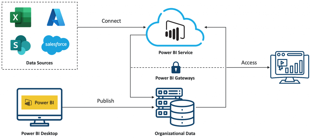
Data Sources: Power BI can connect to a wide range of data sources, including databases (SQL Server, Oracle, MySQL, etc.), cloud services (Azure, Google Analytics, Salesforce, etc.), Excel spreadsheets, and many others.
Power BI Desktop: This is a free desktop application used by analysts and developers to create data models, reports, and dashboards. Power BI Desktop allows users to connect to data sources, transform and clean data, and design visualizations.
Power BI Service: Also known as Power BI online, this is a cloud-based service provided by Microsoft. It allows users to publish, share, and collaborate on Power BI reports and dashboards. The Power BI service hosts the web portal where users can access reports and dashboards from any device with an internet connection.
Data Gateway: For on-premises data sources (e.g., SQL Server databases), Power BI requires a data gateway to securely connect to these sources from the Power BI service. The data gateway acts as a bridge between the on-premises data sources and the cloud-based Power BI service, allowing for data refreshes and live connections.
Data Storage and Processing: Power BI stores data in its cloud-based storage known as Power BI data models. This storage includes datasets, which are collections of tables and data imported or connected from various sources. Power BI also provides data processing capabilities, including data transformation, aggregation, and modeling.
Visualizations and Reports: Power BI allows users to create interactive visualizations and reports using the data imported or connected to Power BI Desktop. These reports can include various types of visualizations such as charts, graphs, maps, and tables.
The Major Components of Power BI
Power Query: Power Query is a data connectivity and data preparation technology that enables you to discover, connect, combine, and refine data across sources. In Power BI, Power Query is an essential component used for data preparation and transformation. It provides a user-friendly interface for importing data from various sources such as databases, Excel files, text files, web pages, and more.
Power Pivot: Power Pivot is a data modeling tool, where users can import multiple tables of data, establish relationships between them, and define calculated columns and measures using DAX (Data Analysis Expressions), a powerful formula language. These models can then be visualized using Power BI’s robust visualization capabilities to gain insights into the data.
Power View: Power View is a data visualization tool that allows users to create interactive visualizations of their data. It enables users to easily explore, analyze, and present data using a variety of visualizations, such as charts, graphs, maps, and tables. These visualizations can be interactive, allowing users to filter and drill down into the data to uncover insights.
Key Features of Power BI
- Data connectivity: Power BI can connect to various data sources, including databases, spreadsheets, cloud services, and online services like Salesforce, Google Analytics, and Azure
- Data transformation: Once connected to a data source, Power BI provides tools for data transformation and manipulation. Users can clean, reshape, combine, and enrich data using Power Query Editor, a built-in tool within Power BI Desktop. This allows users to prepare their data for analysis and visualization
- Data modeling: Users can create relationships between different data sources and perform data modeling tasks, such as data cleansing, transformation, and enrichment
- Power Map: Power Map in Power BI is a 3-D data visualization tool that allows users to visualize and analyze geographic and spatial data in a three-dimensional environment. With Power Map, users can plot data points such as cities, countries, or specific locations on a map and then visualize associated data attributes through various graphical elements such as color gradients, size of data points, or height extrusions
- Filters and Slicers: Filters and slicers allow users to interactively filter and slice data within their reports and dashboards. Users can add filter elements to their reports to dynamically control which data is displayed based on specific criteria, such as periods, categories, or regions
- Drill-down and Drill-through: Power BI supports drill-down and drill-through functionality, allowing users to explore hierarchical data or navigate to more detailed information. Users can drill down into aggregated data to view lower-level details or drill through to related reports for deeper analysis
- Dashboards: Users can create interactive dashboards that consolidate key metrics and KPIs from multiple reports and data sources into a unified view
DAX in Power BI
DAX stands for Data Analysis Expressions. It’s a formula language and a collection of functions for manipulating and analyzing data in Microsoft Power BI. DAX allows users to create custom Power BI calculations, such as columns, measures, and tables.
There are two primary calculations you can create using DAX,
- Calculated Columns
- Measures
Calculated Columns: In Power BI, calculated columns are custom columns that are useful when you want a calculation for every row in your table based on calculations or expressions you define using the DAX (Data Analysis Expressions) language on existing columns.
- Unit Price = Sales/Quantity
- Cost Price = Sale – Profit
Measures: A measure in Power BI DAX is a formula that performs some calculations based on the data in your model. Measures are dynamic and respond to user interactions such as filtering, slicing, or drilling down. Measures are commonly used for calculations like sums, averages, counts, percentages, ratios, and other complex aggregations based on conditions.
- Total Sales = SUM(Orders[Sales])
- Total Profit = SUM(Orders[Profit])
- Average Sales = AVERAGE(Orders[Sales])
Let’s jump into Power BI Desktop and Visualizations.
The Power BI interface looks like below.
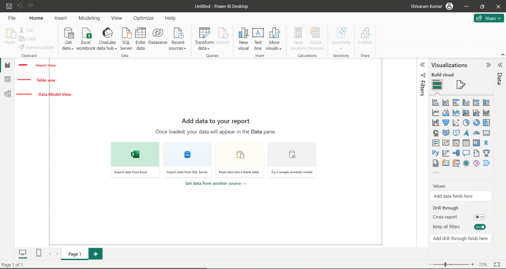
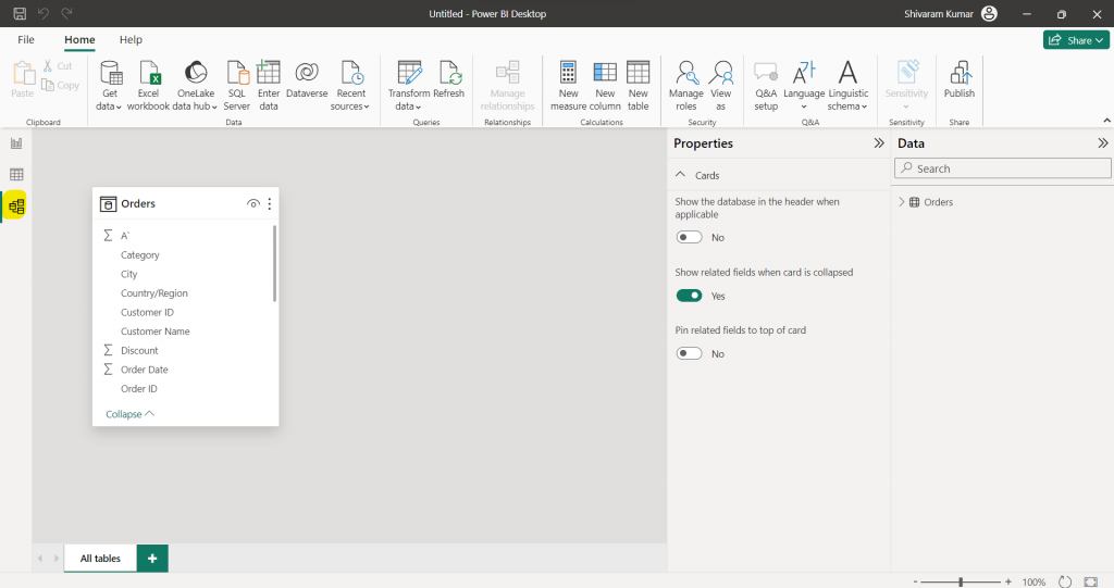
In the top ribbon, we can see the Home, Insert, Modeling, View, and Optimize tabs. On the left, we can see the Report View, Table View, and Model View tabs. On the right, we can see the Visualizations pane.
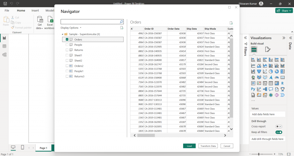
I am connecting a data source through the “Import data from Excel” option.
Once we connect, we can see all the available sheets from that Excel and we have to select the one which we want to import. In my sample, I have selected only the “Orders” sheet.
Here we can clean up our data by using Transform data or else we can directly load our data.
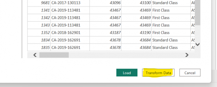
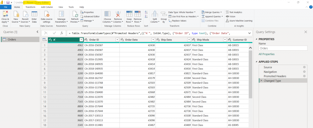
If we click on Transform data, it will open the Power Query editor view. There we can make many changes like deleting a column, creating a new column, merging a column, etc.
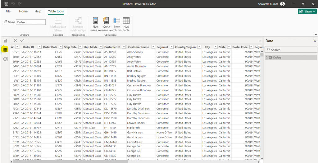
Once we click “Close & Apply”, we can see the imported data in the Table view and the Imported tables in the Model view.
If we select any visual in the visualizations blade, that visual chart will appear on the Report view page. There we have to add our attributes(columns) for the data we want to show on that visual chart.
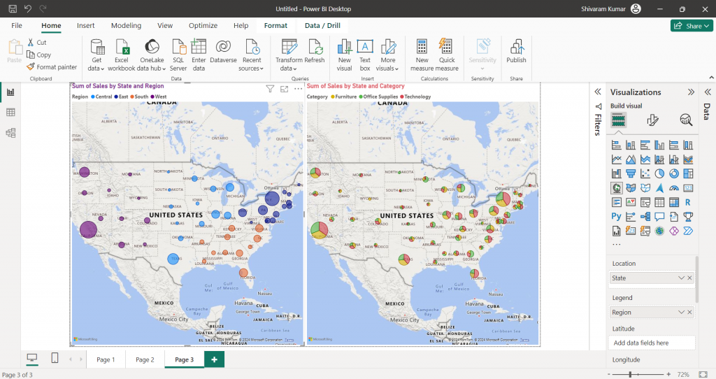
In the below example, I have taken two Map visuals to display sales value by State and Region, and State and Category. The bubble size in the map will indicate the sales value in that region and the pie chart bubble will indicate the sales value by product category-wise in a particular state.
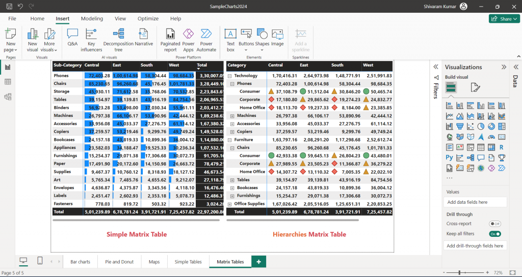
In Power BI, we can create a matrix table to display data in rows and columns, like a pivot table in Excel. Like the Table visual, we can apply conditional formatting in the Matrix table. In Matrix, we can use a hierarchical table by grouping columns.
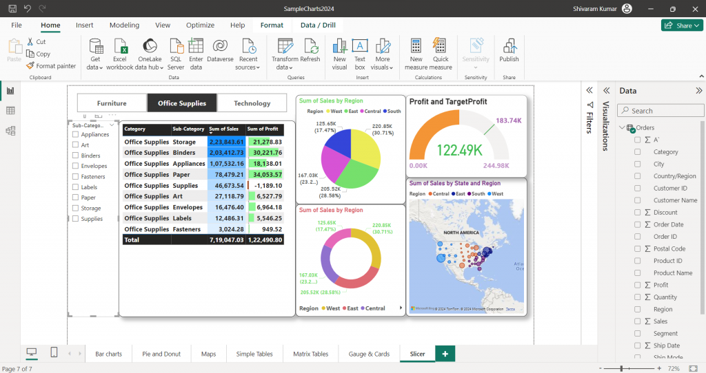
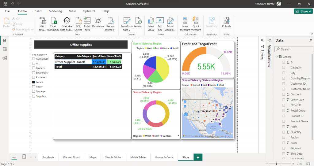
A slicer is a powerful filtering component that allows users to interactively filter and slice data within a report or dashboard. Slicers provide a user-friendly interface for selecting filter criteria, making it easy to explore and analyze data.
Below is a report with two slicers vertically on the left and horizontally on the top.
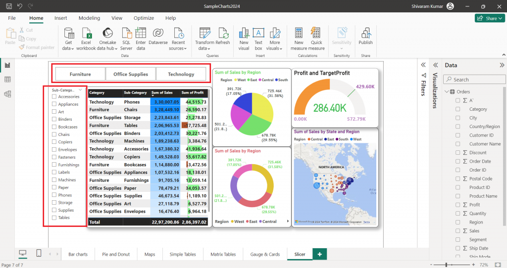
In this report, first I selected “Office suppliers” from the Category slicer and then I selected “Labels” from the Sub-Category slicers. Slicer will interact with all the charts in that report and display the filtered data.
RLS (Row-Level Security) In Power BI
Row-level security (RLS) in Power BI is a feature that allows you to restrict access to data at the row level based on roles assigned to users. This means you can control which rows of data users can see based on their role or identity. RLS is commonly used to ensure that users access only the relevant data while preventing them from accessing sensitive or unauthorized information.
RLS only restricts data access for users with Viewer permissions. It doesn’t apply to Admins, Members, or Contributors.
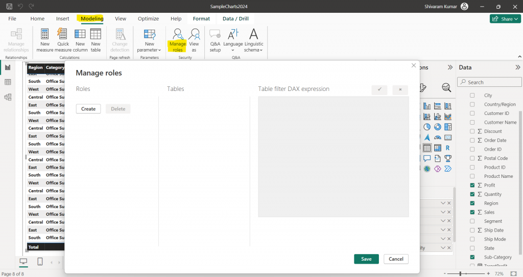
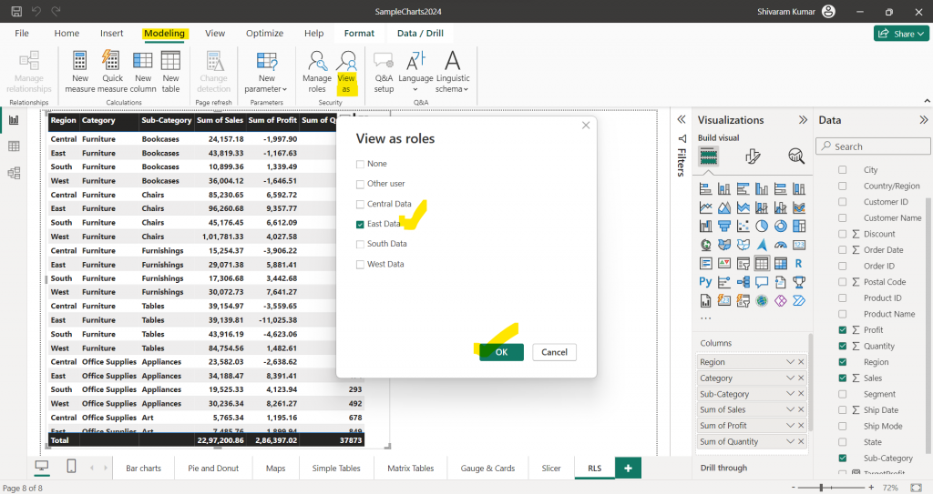
Select the Modeling tab to create RLS and click the Manage Roles icon.
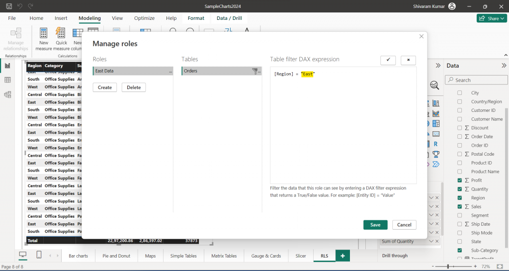
Provide a name for the role and select the table. Add a filter with column “Region” where [Region] = ”East”.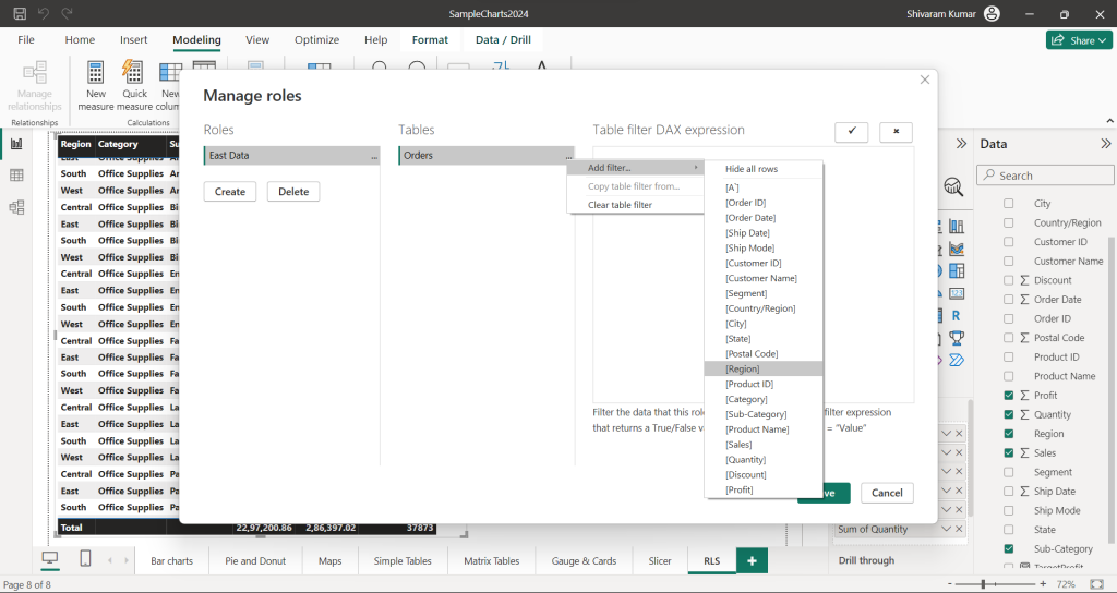
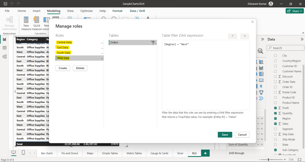
Same as having to create for the other three regions.
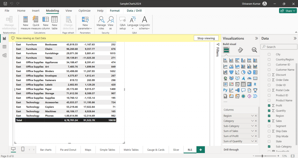
To apply this RLS, select the Modeling tab, click on “View as” select the required role from the available list, and click OK.
There we can see East region data only.
In this way, we can add users also in roles and restrict those users from viewing the data.
Above all are regularly used visualizations and apart from there are 200 + visualizations we can use in Power BI reports based on business user’s requirements.
Conclusion
Power BI is a powerful and versatile business intelligence tool that enables users to visualize and analyze data from various sources, helping organizations make informed decisions. Its intuitive interface, robust features, and integration capabilities make it a valuable asset for businesses to gain insights and drive growth. With its extensive range of functionalities, Power BI empowers users to create interactive reports, dashboards, and data visualizations, ultimately fostering a data-driven culture within an organization.